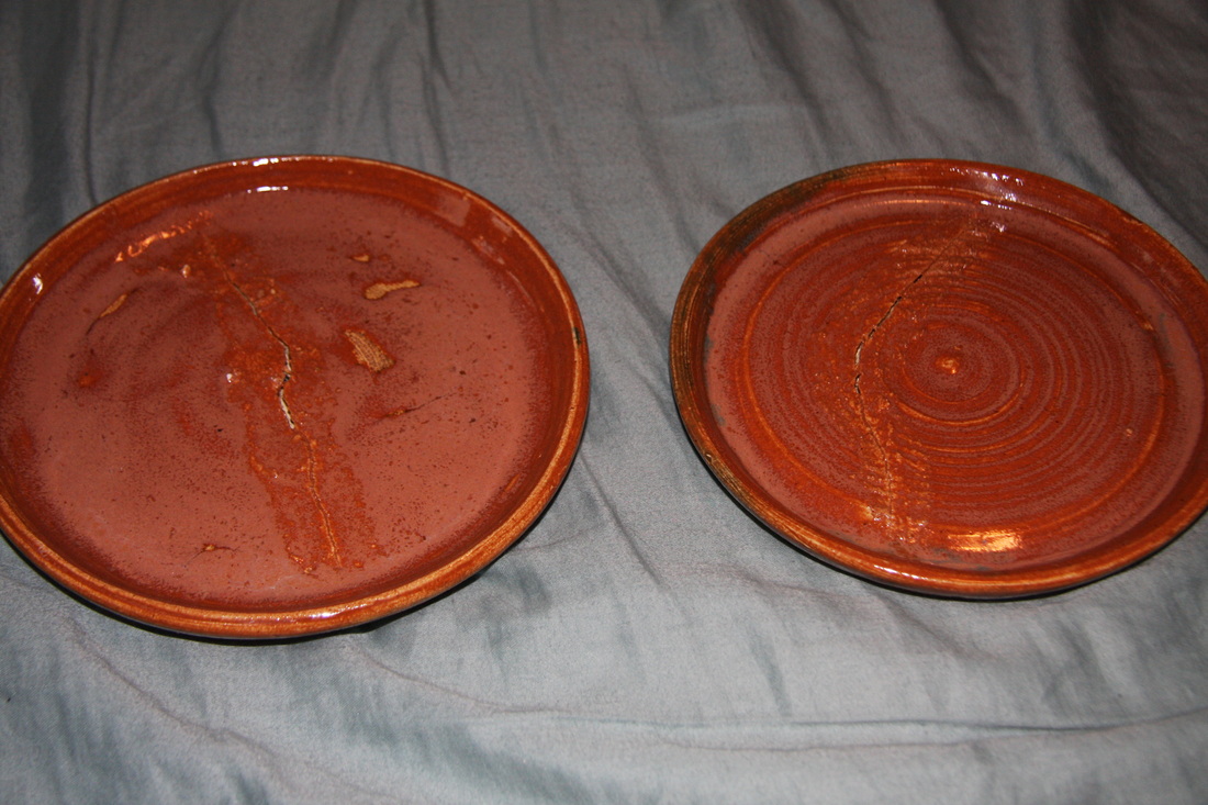
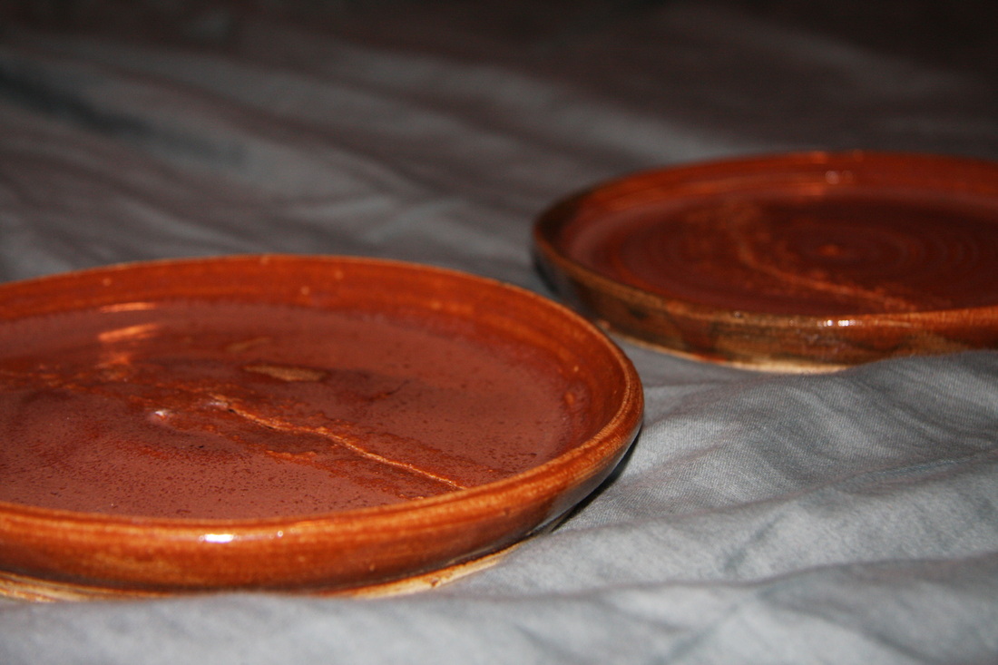
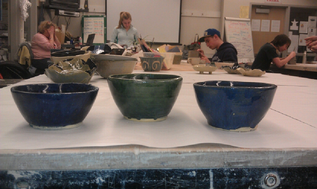
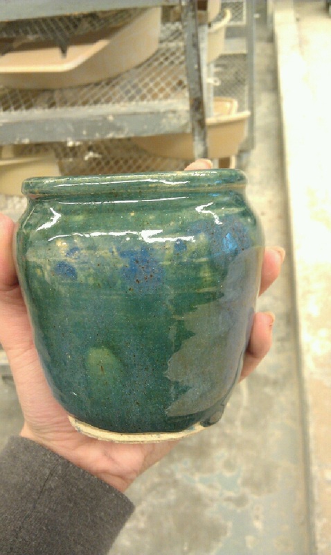
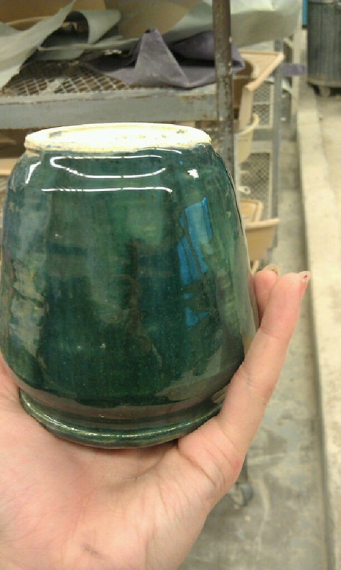
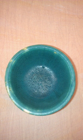
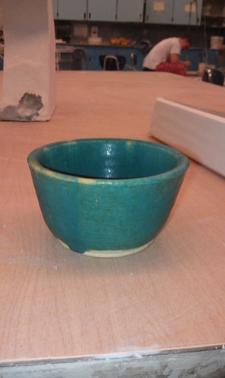
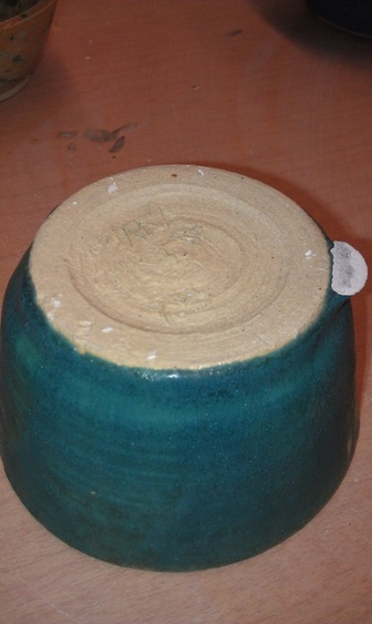
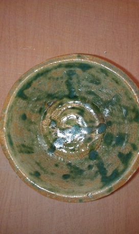
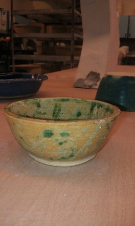
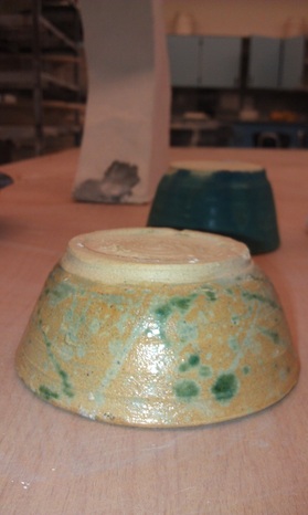
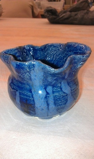
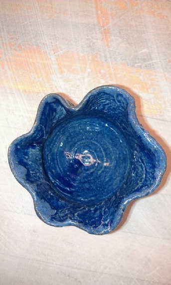
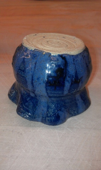
These two plates were the firsts I have ever made. I tried to create them using varying throwing techniques, but they both cracked in the kiln. I am not sure as to whether it was because they were put in too soon, or they were too thin in the middle, but we tried to fix them with cement, but the crack persisted. While that is indeed unfortunate, I am pleased with the way they turned out. I glazed four projects with the same glaze, so that they would appear as a set, and I layered a random red color I found under the orange top coat, and I think it created a very nice, rich, earthy color. As for the plates themselves, I think they look very pleasing to the eye (well, minus the large cracks in them), and I am over all very happy with them. I will continue trying to perfect my plates so that next time they hopefully will be useable!
This bowl was just extra and for no particular project. This was a result of another glaze mixture. It came out surprisingly very, very cool. I mixed different variations of the blue glazes, which were all varying thicknesses and colors. Thus, when I poured it onto the project, different glazes stayed on top in different places due to the variation in thickness. It is a deeper color blue than is represented in the photos, and when looking into the center of it, it appears to look similar to the night sky. The bowl is sloped so it resembles a dome, and there are different spots of light and dark contrasts which create the illusion of depth in the piece, which also contributes to the night sky look. I am SO pleased with this pot!
For my set of three, I decided to make three bowls. The original intention was to create three blue bowls of similar shape and size with different combinations of blue and green glazes. Though the details are difficult to see in the photos below, the glaze mixtures turned out to be very interesting and original. One of the blue ones was mixed with a blue color with spots and speckles in it, which creates this pattern on the inside of the bowl that is almost reminiscent of a night sky or photos of a galaxy. The other two had differing variations of thicknesses within the glazes that I mixed, and thus layered on top of eachother in very interesting ways. They often streaked down the bodies of the bowls in such a way that leads to the center of the project. This accentuates the curvatures of these bowls and draws attentions to the shape of the project. I do however, wish that the green bowl glaze mixture had turned out more blue, as it would have matched the rest of the set better. However, they do still go together as they are all glazed cool colors and have similar shapes and sizes. Over all, I am very pleased with the outcome of these, as each bowl I made got progressively better than the last.
This project is intended to be my tall project, though it shrunk alot in the kiln. It still is taller than it is wide, however. The vase has a very proportionate lip, body, and foot ratio. It is almost split into threes, which is very naturally appealing to the eye. The foot ring and the lip of the vase are of even widths, which is excellent as it helps to create the look of symmetry. The glaze is extremely shiny, and almost reflective in some lights. For this glaze, I mixed three colors together and painted on another layer of a blue color. This created a very interesting, unique blue green color that varies around the outside, but is even and darker on the inside. There are some spotty pieces with the glaze, which I will fix next time by using something other than my hand to dip the project. Out of all the projects I have made thus far, this is easily my favorite, because I love the rich, yet shiny color of the glaze, and I feel that the simpleness of the color contributes to the shape of the vase, by not distracting from it. Over all, I am very pleased with this project, even though it is not the traditional shape of a "tall project".
This bowl also, disappointingly, shrunk! I do apologize to the person who has to eat out of this little thing, and I have learned a lesson for the next time I throw something! Assume it will shrink! This bowl I am also rather proud of. It has a very rounded edge, which I like, as I feel that it accentuates the roundness of the bowl and doesn't necessarily draw attention away from the color of the glaze. The glaze is a very interesting teal color, with some freckles of a darker color in it. This project is interesting, as I glazed it in the reverse colors of Bowl number 1 (see below) and it came out completely different! I feel like this is a much more effective and pleasing color scheme than the other bowl. I chose to reglaze it by putting clear in the inside (as per Ms. Heideman's request), so that it might be more suitable for holding food or liquids. There were some spots where the glaze didn't stick around the lip, which I think are flaws in the project, but don't bother me as much as I would think. It had a pretty thick glaze, and some of it ran while it was in the kiln. So in these photos there is a drip sticking out of the side, but I learned how to grind down the glaze and now it looks much better than it did. Overall, I am really pleased with this project, as I love the way the glaze looks with the shape of the bowl and I would be happy to give this bowl away, because I actually like it.
This project is a bowl, intended for donation for the food bank program. I did not account for how much this bowl would shrink, and thus is came out very small! The surface decoration is not something I am indeed very fond of. The colors were not labeled when I glazed this, and so it was kind of an experimental glazing job. I personally think that the green glaze splattered would have looked much better if not for being a green color that is slightly reminiscent of mold. The inside of the project ended up being a lot shinier than the outside, and looks much nicer, as it has a much more manageable amount of glaze. I liked the freckled color as the base coat of the project, but if I had known the top splatter color was green, I would have done something different to further accentuate the color and speckles of the base glaze. I feel like the structure of this bowl, although small, is very good and I am proud of the thinness of the edges and the even-ness of the bottom of the project. While the glazing did not do much for the aestheic appeal of the bowl, I feel like the bowl itself is of good quality and I am pleased with it.
This begun as a vase, actually! It was all going very well until I made one sharp little move and it got all wonky at the lip. I was then inspired to turn it into an altered lip project, by pushing in parts of the lip. The surface decoration of this piece was done in two glazes. I dipped it originally in the cobalt blue color, and the secondary dripping color was unidentified in the glazing room so I took a chance on it and it turned out to be a lighter blue color with little specks of brown in it. The cobalt glaze color was very thin when I glazed it, and thus has this almost water-like effect on the contours of the project. The second glaze color seemed to be thicker and thus didn't drip as well over the sides of the project as I had originally intended. The glaze dripped from the bottom of the pot was intended to balance out the movement of the lip, however I feel like it was done a little sloppily and didn't blend together as well as I had thought it might. I also wish that the lip itself was more evenly spaced out with the wave itself, however I do think that it looks a little more natural, as one side of the lip is a little higher than the other. Over all, I think it was a very interesting experiment with shape and color, but next time I would like to pay more attention to the detail and maybe think of a better way to accentuate the curved lip of the project.
|
AuthorWrite something about yourself. No need to be fancy, just an overview. Archives
May 2012
Categories |