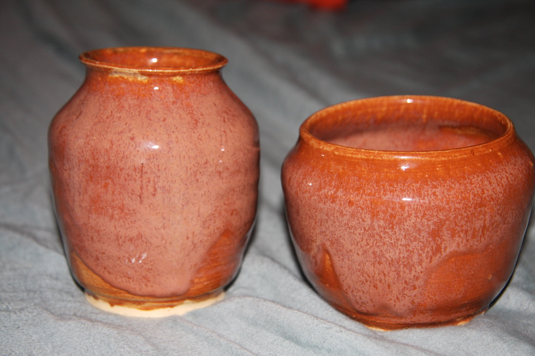
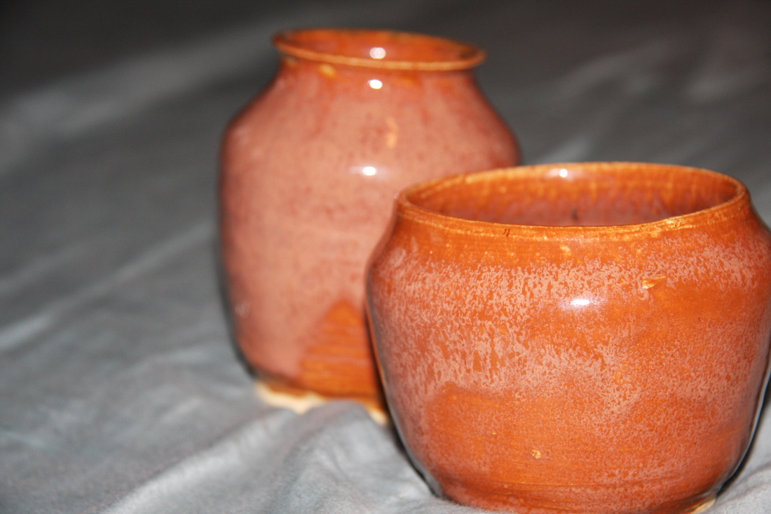
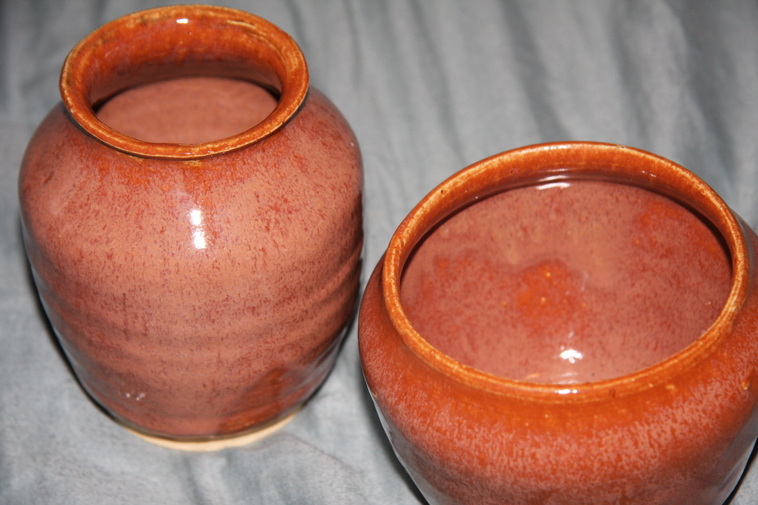
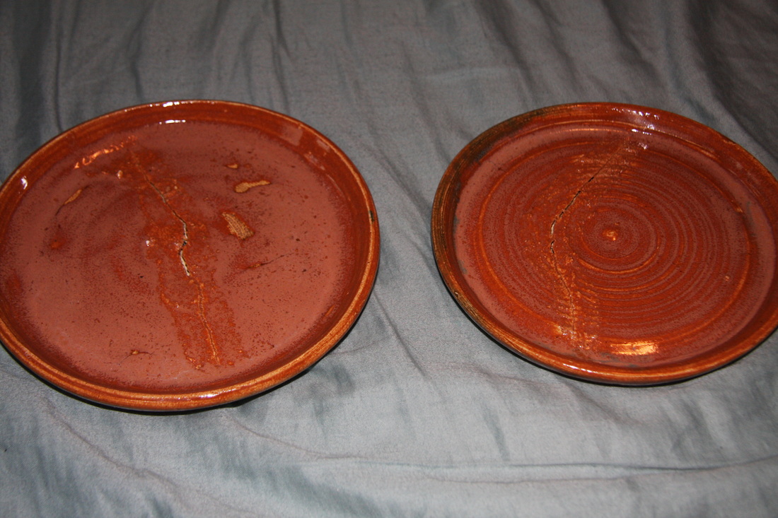
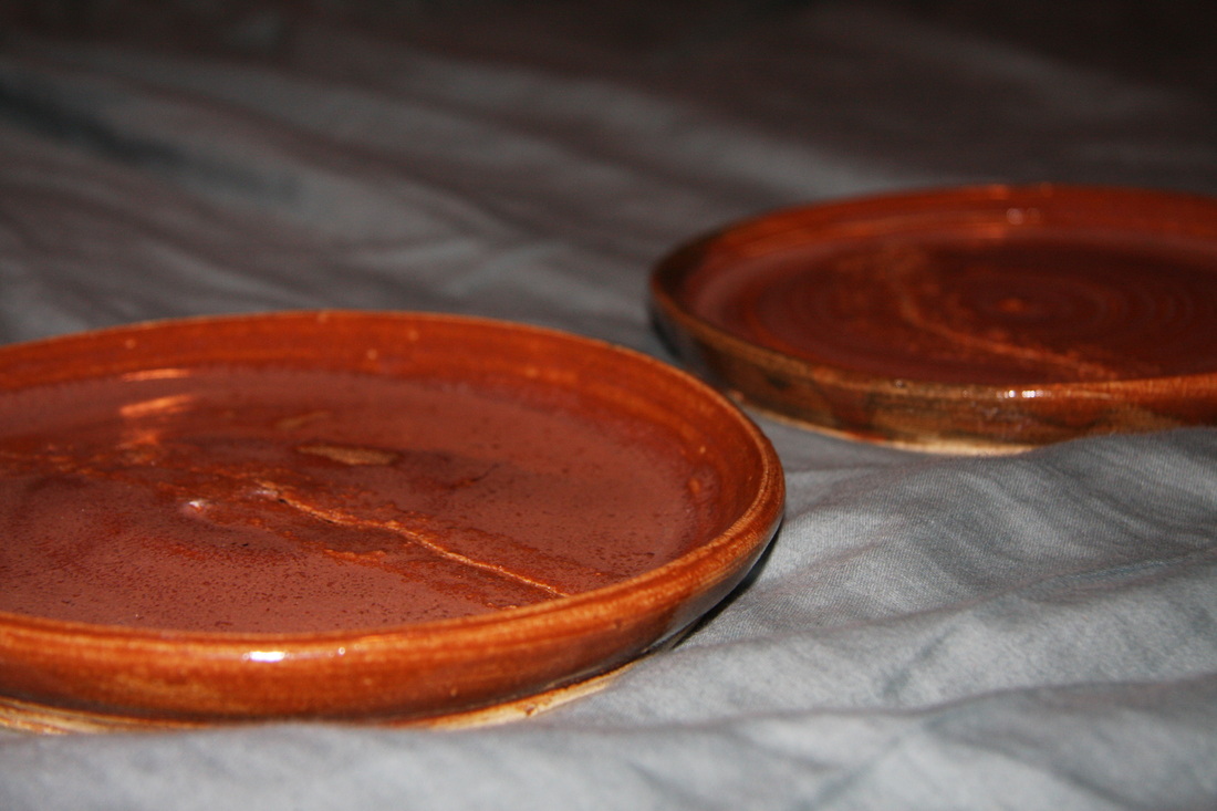
These two vases were intended to be a part of the plate quartet. I glazed them all in the same way, with red under the orange color, and the glazing effect came out to be very interesting. lighter orange color looks drippy, which contributes to the roundness of the vases, as it creates a ledge that draws the eye to the roundest part. I personally like the lip of the taller vase compared to the shorter one, but I was trying to experiement with different styles. The glazing makes them look much different than other pieces I have previously made, and thus I am very partial to them. I plan to use them for pens and paper clips and the like. Over all I am greatly pleased with the way these turned out, and the way they go with the other two plates I made.
These two plates were the firsts I have ever made. I tried to create them using varying throwing techniques, but they both cracked in the kiln. I am not sure as to whether it was because they were put in too soon, or they were too thin in the middle, but we tried to fix them with cement, but the crack persisted. While that is indeed unfortunate, I am pleased with the way they turned out. I glazed four projects with the same glaze, so that they would appear as a set, and I layered a random red color I found under the orange top coat, and I think it created a very nice, rich, earthy color. As for the plates themselves, I think they look very pleasing to the eye (well, minus the large cracks in them), and I am over all very happy with them. I will continue trying to perfect my plates so that next time they hopefully will be useable!
This bowl was just extra and for no particular project. This was a result of another glaze mixture. It came out surprisingly very, very cool. I mixed different variations of the blue glazes, which were all varying thicknesses and colors. Thus, when I poured it onto the project, different glazes stayed on top in different places due to the variation in thickness. It is a deeper color blue than is represented in the photos, and when looking into the center of it, it appears to look similar to the night sky. The bowl is sloped so it resembles a dome, and there are different spots of light and dark contrasts which create the illusion of depth in the piece, which also contributes to the night sky look. I am SO pleased with this pot!
For my set of three, I decided to make three bowls. The original intention was to create three blue bowls of similar shape and size with different combinations of blue and green glazes. Though the details are difficult to see in the photos below, the glaze mixtures turned out to be very interesting and original. One of the blue ones was mixed with a blue color with spots and speckles in it, which creates this pattern on the inside of the bowl that is almost reminiscent of a night sky or photos of a galaxy. The other two had differing variations of thicknesses within the glazes that I mixed, and thus layered on top of eachother in very interesting ways. They often streaked down the bodies of the bowls in such a way that leads to the center of the project. This accentuates the curvatures of these bowls and draws attentions to the shape of the project. I do however, wish that the green bowl glaze mixture had turned out more blue, as it would have matched the rest of the set better. However, they do still go together as they are all glazed cool colors and have similar shapes and sizes. Over all, I am very pleased with the outcome of these, as each bowl I made got progressively better than the last.
This project is intended to be my tall project, though it shrunk alot in the kiln. It still is taller than it is wide, however. The vase has a very proportionate lip, body, and foot ratio. It is almost split into threes, which is very naturally appealing to the eye. The foot ring and the lip of the vase are of even widths, which is excellent as it helps to create the look of symmetry. The glaze is extremely shiny, and almost reflective in some lights. For this glaze, I mixed three colors together and painted on another layer of a blue color. This created a very interesting, unique blue green color that varies around the outside, but is even and darker on the inside. There are some spotty pieces with the glaze, which I will fix next time by using something other than my hand to dip the project. Out of all the projects I have made thus far, this is easily my favorite, because I love the rich, yet shiny color of the glaze, and I feel that the simpleness of the color contributes to the shape of the vase, by not distracting from it. Over all, I am very pleased with this project, even though it is not the traditional shape of a "tall project".
|
AuthorWrite something about yourself. No need to be fancy, just an overview. Archives
May 2012
Categories |